
This particular poster is advertising a documentary film dedicated too Helvetica.

This is a selection of famous logo's which all use a variant of the Helvetica typeface.
 Another very interesting designer I have discovered recently is Kotama Bouabane. And the particular collection with relevance to my current typography project (And incidentally my favorite of his work) is his 'Words will melt you' artwork. In this he uses ice letters placed in certain environments to represent the message it is hoping to get across.
Here is his website where you can look at all his other work
http://www.kotamabouabane.com/

Herb Lubalin
Herb Lubalin started his design career in the year of 1939, when he entered his first poster competition, filling an ‘O’ with a bottle lid within the statement “Its Tops.” Lubalin left with the second place prize and swore to devote his life to “pursuing an ‘O’ filling career.” Since this point Lubalin has created some extraordinarily beautiful pieces of typography and design, whilst creating a collection of aesthetically brilliant typefaces along the way, including ‘Avant Garde’ and ‘Lubalin’.
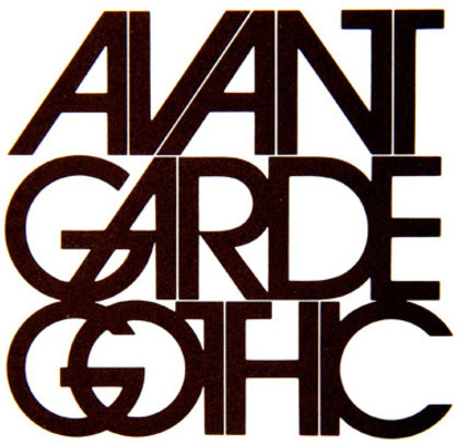
Above is an example of 'Avant Garde Gothic', my personal favourite of Lubalin's typefaces. I just love the seemingly effortless way the letters just gell together, in particular the A's and V's.
This is a very famous logo designed by Lubalin for the brand Mother & Child. As you can see the '& Child' is present inside the 'O' of mother. Not only this however, it is made in such a way for it to resemble a womb with the & sign forming an embryo. Incredibly well designed.