Animation Inspiration

I don't plan on doing animation as a career, but nevertheless, I have always had an undying love for it growing up. That's more than likely due to the unhealthy amount of cartoons I watched as a child but regardless, I still enjoy a good animation. Here are a couple of examples of fantastic animators I have recently discovered.

The first I want to point out is the genius work being produced by Baby Cow Animation.
I am a fan of The Mighty Boosh so I when I found out they had made this animation for them I loved them even more. It's probably not everybody's cup of tea as it is the sort of intense strangeness that The Mighty Boosh brought to the mainstream. Still a nicely done animation if you don't like the dialog as much.

The second animation group I want to show is a site that I have been a huge fan of for quite some time now and that is the absolute witty insanity created at Weebls Stuff. Once again, a lot of people will not like the dry humour on display but I for one, feel like a child in a sweet shop with the seemingly endless back catalogue of weird and wonderful animations. 'Weebls-stuff' are made up of 7 individuals each having their own roles in the ongoing process on the site. Animation, audio, script-writing, web design and site technicalities are all covered by a team which very clearly are having the time of thier life in a dream job.
This is just a small example of the downright madness. I have linked the website earlier in this paragraph where you can view all other toons, play on games and laugh your face off.
This particular example was commissioned by Weebl to be animated by 'EddsWorld', with the music and lyrics bizarrely made by Weebls-stuff.


Typographic Research

Statistically the most popular typeface on the planet, Helvetica, was designed by Max Miedinger with Eduard Hoffmann at the 'Haas'sche Schriftgiesserei (Haas) of Münchenstein', Switzerland in 1957. Haas set out to design a new sans-serif typeface that could compete with the successful Akzidenz-Grotesk in the Swiss market. Originally called Neue Haas Grotesk, its design was based on Schelter-Grotesk and Haas’ Normal Grotesk. The aim of the new design was to create a neutral typeface that had great clarity, no intrinsic meaning in its form, and could be used on a wide variety of signage.


 This particular poster is advertising a documentary film dedicated too Helvetica.


This is a selection of famous logo's which all use a variant of the Helvetica typeface.

Another very interesting designer I have discovered recently is Kotama Bouabane. And the particular collection with relevance to my current typography project (And incidentally my favorite of his work) is his 'Words will melt you' artwork. In this he uses ice letters placed in certain environments to represent the message it is hoping to get across.

Here is his website where you can look at all his other work
http://www.kotamabouabane.com/


Herb Lubalin

Herb Lubalin started his design career in the year of 1939, when he entered his first poster competition, filling an ‘O’ with a bottle lid within the statement “Its Tops.” Lubalin left with the second place prize and swore to devote his life to “pursuing an ‘O’ filling career.” Since this point Lubalin has created some extraordinarily beautiful pieces of typography and design, whilst creating a collection of aesthetically brilliant typefaces along the way, including ‘Avant Garde’ and ‘Lubalin’.


Above is an example of 'Avant Garde Gothic', my personal favourite of Lubalin's typefaces. I just love the seemingly effortless way the letters just gell together, in particular the A's and V's.

This is a very famous logo designed by Lubalin for the brand Mother & Child. As you can see the '& Child' is present inside the 'O' of mother. Not only this however, it is made in such a way for it to resemble a womb with the & sign forming an embryo. Incredibly well designed.


Mastodon reveal new album artwork!

  The artwork for the latest Mastodon album was made by the incredible wood carver AJ Fosik. The image shown to the left is said album cover, and it actually amazes me that something so complex could be made entirely of wood. And if there was even any doubt, I have also provided one of the bands recent music video's which is handily also a look at the process taken to make the sculpture.


This bold move to a new artist is the first time in the bands career to not use artist and designer Paul Romano. All four album covers below were designed by him, as well as many more distinctive pieces which can be found on his website linked in his name.


Four Lions - Design inspiration

After recently purchasing the DVD for a film I have loved since it's debut in British cinemas last year, I adored the way the box cover (and incidentally the poster too) are put together. It was designed by All City Media, quite a strange thing for a media company to do but I guess you get work where you can when in the design industry.
I also like the fact the film's recommendations are all simply the word 'funny', which on it's on would not really sell the film at all but as a collective has a humour value about it in itself.


 This minimalistic alternative was created by Jon Contino and Film favourite Olly Moss, who I have reviewed and admired many times before in college projects and on here. The attention to detail, while staying as simplistic as possible is what makes it work so well. The Hebrew type and the bomb wick resembling the string off a postage label are particular highlights for myself. The only problem I personally have with it is how bright the red background is. Moss' posters usually have a lovely balance of colour's, but this is simply too bright. It detracts from everything else and doesn't do the advertisement any favours.


The film as a whole was brilliant in my eyes. Although, you can't really go wrong with a director as hilarious as Chris Morris (Who I will be reviewing shortly). The viewing may be uncomfortable for some viewers as it  can be seen as a bit of a taboo subject in the world of film, but I think that's why I enjoyed it so much. It dared to stand out there and do something different. I think I just got a new favourite film.

Undisputed levels of awesome

Ladies and gentlemen of the blogging universe, I present to thee perhaps one of my favourite songs of all time (which coincidentally also has a top notch video).

Kasabian - Shoot the Runner

I'm not sure what to say about this video apart from how amazing it is. The simplified black and white figures  with almost potent doses of colour is dashing, and almost trippy at times to put it bluntly.
It combines my love of music and design perfectly so basically, take a look.


Peace.

University reviews

University is a daunting prospect. Yet at the same time it is something I am unbelievably excited for, despite it being over a year before I am able too go. This excitement has been building up more and more with every piece of work I am proud to call my own, every college project that passes, and every university open day I attend. And with every University degree show, open day or look around the city it is in, I am making a mental checklist of the courses and cities I would love to have the opportunity to study in. Here are my options and reasons behind those options too date.

Manchester Metropolitan University. Everything about this place speaks volumes to me. I have grown up with its music scene almost permanently in my ears, regardless of the fact I live in Derbyshire. My sister has been studying there for the past 3 years so and with regular trips to see her I have become familiar with the city. And its nightlife, which for any student craving a good social life alongside excellent study is perfect. But what really struck me upon seeing the degree show is the quality of work produced by the majority of the students there. Usually when seeing a collective of other peoples work there will be several standout pieces and then a large amount of average but not outstanding work on display. But here it was a different story altogether. I found a very large amount of the images I witnessed to be captivating, intriguing and most importantly, just very well designed. A particular highlight being the work of John McPartland, a graphic designer and typographer who studied at the university. His graphic awareness was a genuine pleasure to witness, and I wouldn't be surprised too be seeing his name in high places after such a showcase of design.
A stand out piece of John Mcpartland's work

Along with most of the students work, there was business cards on display with details of how to get in touch with them, some of which were rather tacky but here are a bunch of ones that I found quite nice, some kooky, some as a nice little piece of their work. It gives an insight into how I might design my card when the time comes.

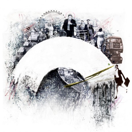
Another collection of work that caught my eye was the work of George Sarell, Who had his work on display in the course entitled 'Animation with illustration', A course I had been looking at on the website and was quite curious as to what it would entail. His work was, in my eyes, the most unique and entertaining on offer from the graduates on that course. Each piece with it's own political message in a similar cartoon based style.
The example provided below is targeting the NHS cuts made by our Prime minister David Cameron, And in its own way, It makes not only those who are passionate about politics take notice, but also those with any sort of appreciation for illustration.


All in all I feel my couple of trips to Manchester have further solidified the fact that this is a front runner for my favourite universities, And It is definitely going to be one of my UCAS options come Christmas time.


Onwards to Teesside University, Middlesborough.

When browsing through University websites and scheduling open days, Teesside really caught my eye with what seemed to be genuine interest in their own courses and thriving to out-do any rivals. So understandably when travelling there I was hopeful that this would entice me as much as Manchester has done. And believe me, there was alot of time to think about my options as the travel there and back was approximately 4 hours each way. If I do end up going to Middlesborough the rigorous travel time will have to be brought into consideration as if I need to return home in an emergency it is relatively hefty.
Upon arrival we was greeted by a man with an iPad who clocked me in and got me a selection of maps and prospectus's and we were sent on our way to explore the campus. A very friendly atmosphere and a beautiful university, I liked it all ready. I attended a few lectures and tours throughout the day on various subjects and accommodation and was positively impressed by absolutely everything. The Video game design and development courses intrigued me at first but after the lecture I was put off by the style of work they went through, As it was not at all like what I have been studying at college, I'll stick to just playing the games for now.
I then made my way to the art and design building to observe the Graphic Design course. Before even entering the building I knew I would not be disappointed. A purpose built building for art and design made only 4 years prior to now, with a floor dedicated to every subject. Myself and my parents had arrived approximately fifteen minutes early but we were greeted and were welcomed with a drink and free roam of the graphic floor. With portfolio's from students of not only the third year like every other University we have been too, but from the first and second years too. Showing a clear progression with all of the students on that course. It's easy to say I had fallen in love with this university from barely a few hours on campus and it had definitely secured a place in my top two Uni's alongside Manchester MET. An hour later sitting through an introduction to the course from the 4 lecturers on the course and I was still pumped with excitement. It must be a sign that this is one of the Uni's for me as it's gotta be something good to keep me entertained for a large period of time, as I admit, I am a fidgety and easily distracted young man at times.
We then made our way outside into terrential rain but I tried to ignore it as we were scheduled for an accomodation tour in five minutes. We arrived to a friendly student who was eager to show us all the campus options available for first year students. Shared halls, shared houses, single houses, flats, parkside halls, everything was covered and I had mixed opinions on all the choices if i'm honest. The halls were definitely up there as top choices as the shared environment and atmosphere sparked some intrigue for me. It really reminds of the kind of campus feel portrayed in American University TV programs. And believe it or not, that attracted me greatly. The houses came with two options. More space and a shared toilet, or extremely limited space with en-suites. And neither sparked any interest from me. The least of which being the en-suite rooms. As much as having my own bathroom would be great, a year with such limited space is not the one for me.
A long drive back is not a problem for me and as I write this on the journey home I know that when choosing my course, this is a favourite. Without a doubt in my mind, It will take alot to beat Teesside.


And we save the worst till last.

Leeds University. On paper, It has everything going for it. In reality, it ticked a minimal amount of boxes for me. Yes, the campus was a classic and atmospheric space. Yes, The student union looked the perfect venue for club nights and gigs alike. However there was one major drawback. The Graphic Design course on show was absolutely terrible. The lecturers were not very welcoming, the work on show seemed very limited for a bunch of students who had just spent three years at that university, and the students there offering their knowledge didn't reflect any sort of enthusiasm for people supposedly destined for the design industry.
After a rather dreary and confusing walk trying to locate the lecture room for an introduction to the course (may I add with no sort of signage whatsoever) I entered the room and sat in anticipation that after all that wrong there would be a spark of right.
Oh how I was wrong.
The seemingly endless seminar from a man who was oh so arrogantly confident in his own design prowess he had forgot to put any effort to making his own graphic design slideshow have any hint of graphic design within it. When he mentioned that there was no portfolio viewing or interview process in selecting who gets on the course I was abit dumbstruck. A design course filled with students academically talented is in theory what you'd expect but in practice it just simply would not work. What about the talented designers who aren't gifted in English Literative skills? Who express excessive amounts of personality in thier work? They don't get a look in as the lecturer is too 'busy' with other projects to attend to minor tasks like picking the future of British design. This hour long lecture took place in a dark lecture hall with no air conditiong on, even though we could clearly see it was available on the cielings. And if they can't be bothered to turn it on with a room full of potential students and parents (A percentage of which would be hormonal women) working up a sweat, It does not exactly spell good news for anyone looking to study their for 3 years.
In conclusion to my ranting and raving on the matter, It's pretty clear that this particular university is not an option for me. But it's not a wasted journey as It has atleast narrowed down my choices abit. Two out of three aint bad I suppose.

I will review more universites later in the year when I attend more open days.
Adios!

Life Drawing 2

 Here is a collated group of 2 sessions of life drawing. One with Alison, the female model, and the other with John, the male model.

 This first image is 2 quick gesture charcoal drawings done in 10 minutes a piece. This were pretty much just too warm up as we did not have a session last week. I like the larger image of the two as even though it's head and legs are somewhat out of proportion, the curves on the figure are quite strong.
 This second piece is a collage using splashes of colour and different textures, The figure has been ruined slightly from a heavy use of ink and the quality of the image is deterred because of the bad lighting.
 The third and final image from this weeks session is once again a collage piece, however this one was done in very little time, in order too get us working faster. Only a couple of different textures have been added, The use of line is quite nice though.
 These images are all from the session with John 2 weeks ago, under different time periods, media and techniques.


Life Drawing.


Here are my first couple of attempts at Life Drawing. They are not terrible but not exactly fantastic either, I will practice quite often to improve my perception of form and shape.

I have however taken some new knowledge away from this session, as measuring can be a big part of life drawing. Using the idea of measuring the body in how many Human heads in length it is (Approx 6/7) and translating that to paper can be very helpful and will greatly improve it's look.

Danny Allison - Illustrator - Illustrative Influence

 "One very talented young man has recognised the absence of clarity of meaning behind most modern illustration and has chosen to address it, juxtaposing a refined focus with sophisticated, witty aesthetic sensibility. Danny Allison’s illustrations are laconic, dry and direct. His strong photographic background marks a profound heritage in his style, sometimes giving his compositions a poignant realism, and often adding some very welcome Python-esque comic relief"
 Danny Allison is behind some of the best illustrations I have seen in a long time. His use of colour and thoughtful imagery is quite unique and iconic. I love his visionary outcomes with hidden messages and strikingly brilliant photomontages.


http://www.dannyallison.co.uk/
 
http://www.illustrationweb.com/illustrators/home_large.asp?artist_id=3310

Olly Moss - Graphic Influence

Olly Moss is a beautifully witty man. His sense of style and humour go hand in hand to create some of the funniest Illustrations and apparel design I have seen, And with the upcoming T-shirt designing project, I already know that my piece will use a similar use of dry sarcastic wit. 
I have provided below a selection of my favourite pieces from his extensive collection of genius design.


 The not-so-subtle randomness of this image is the reason for why it is so funny.  You can't really describe how or why he thought of it, but I am very glad he did so.


Submarine

Today I went to the cinema as a birthday treat to see the film 'Submarine' written and directed by Richard Ayoade. A comedian most famous for his geek shique role in cult comedy The I.T Crowd. I knew I would like it before we'd even set foot in the cinema. And you know why this is? The aesthetic loveliness in the design of the poster.
The connection between type and imagery flows beautifully across the poster, with the photo of the main character seemingly submerged in the cyan on the bottom third of the page. A symmetry in the text at the top of the page with the three primary colours in conjunction, means that the entire poster only uses them three primaries, white, and the absence of colour that is black. This is of course with the exception of the directors name in orange at the bottom, which in normal circumstances may ruin the effectiveness, but in this case it actually works. It keeps the poster balanced and adds enthasis on the writer and director, a very important man in the film making process.

And on top that, I thoroughly enjoyed the film and I recommend it to anyone who's searching for a light hearted feel good comedy. I loved it, and my guess is so will you.

BIG essay

Figurative painting is a skill which is very hard to master to the standard of excellence. And even harder to morph into distressed imagery while still keeping that perfect form. Yet this is something that Jenny Saville, Francis Bacon and Lucian Freud have all manage to do magnificently. Comparisons between the three artists are not only present in their love of the human anatomy, but also in the ways they have evolved their attention to detail from artist to artist. Not exaggerating beauty for the mass public and expressing realistic views of taboo subjects in regard to the human body.


Jenny Saville is a female painter who was born in Cambridge, England in 1970. Her works are usually of large scale interpretations of naked overweight women and disturbed human form. The paintings of these women are often very no holds barred and depict the gritty realism of the human body and its beauty and imperfections. These studies are dark reflections and a deep contrast to the mass publics’ presentation and perception of the human sculpture.
Saville learned and observer a lot of the human anatomy in New York, 1994, where she sat and watched plastic surgeon Dr.Barry Martin Weintraub in his working process. During the times she was watching, she was granted the chance to photograph and document the cosmetic surgery and liposuctions that Weintraub performed. The interventional techniques that Weintraub performed would also go on to influence her understanding of excessive human fat and the extremes of body shapes.
Some artists which are often compared to her, and with similar work styles, are Lucian Freud, Francis Bacon, Willem de Kooning, Pablo Picasso and Peter Paul Rubens, (Bacon and De Kooning were her personal biggest influences).


Saville’s paintings ‘Strategy (South face/front face/ north face)’ appeared on the third Manic Street Preachers album and her piece entitiled ‘Stare’ was the art vinyl for the ninth Manic Street Preachers album. Of these two pieces that were used for album covers, my personal favourite is ‘Strategy’. The way everything down to the title monsterises this woman, and shows her not as a showcase for feminine beauty but as a structure (the title often used for achitectual and orthographic plans) is an thought but never spoke idea. A taboo subject that Saville has approached without fear of disgust, and it is that controversial decision to truthfully portray her models that has propeeled her to the forefront of figurative painting. There is a sense of loyalty to oil painting as a medium for Saville and as technology constantly advances she has resisted the temptation of switching media.


Her arguably most famous piece ‘Stare’ (Feature on the cover of Manic Street Preachers album cover ‘Journal for Plague Lovers’) is once again done in oil paints. And although it was praised by many and even reciever 2nd prize for best Art Vinyl, I am not a fan of the image. I can recognise the skill and workmanship put into painting it but as a whole, I’m not keen. The colours are very bland and pastelly, although it could be argued all her works are of this nature, the exaggerated skin tones are not expressed as vibrantly as they are in some of her other works. With the obvious exception of the bloodied bruising on the subjects face.
In conclusion, my opinion on Jenny Saville is varied. The imagery and the messages she portrays in her work are unmatched, but my personal taste does not include her works. Tonal contrast is a favourable point and her use of different colours and shades to highlight and define shapes can be quite beautiful in its own unique way.
Lucian Freud is a German born painter, born on December 8th 1922 in Berlin, however he became a Naturalised British citizen in 1939. Grandson of Sigmund Freud, The pair were regarded as similar in that Sigmund was nicknamed master of the mind, while Lucian was known as master of the body.
One of Freud’s most iconic images was his portrait of Queen Elizabeth II, which divided both the press and art critics. In the portrait she wears a severe expression and her features are heavily rendered, in the style Freud has become famous for over the years. Some of the critics seemed surprised that Lucian Freud had the audacity to paint his monarch in his usual intense, penetrating style and even went on to call it a travesty. But in my opinion, it is a more realistic approach to painting than exaggerating beauty and erasing any blemishes. Freud takes her features and showcases her rugged, tired self not as hindrances but as part of who she is. The particular attention to her crown shows him highlighting her personality, as that is her character and pretty much all she is recognised for. The colours are dull, pastel and exaggerated in the shadows of her face, which is not a style I find aesthetically pleasing but the not-so-delicate tonal work is mysteriously luring.
Freud’s self portrait is my favourite of his pieces. The muscles and wrinkles in his face make a monstrously realistic map of shadows and contrast. His dull, expressionless face and naked torso are shown and there is an air of vibrancy in this image unlike his other paintings. Light hitting his face from the side casts a dark aura across his chest and lower face, and he shows no fear in exaggerating the amount of shadow cast.
In conclusion, Lucian Freud’s artwork is a representation of the true human form, and it is clear he has influenced the likes of Jenny Saville in their work. Unafraid of controversy, he shows his ability to paint and also take influence from his grandfather’s, Sigmund Freud, Psychological work.
Francis Bacon was born in Dublin, Ireland on 28th October 1909 to two English parents. He later moved to London at the age of sixteen, and then furthermore lived in Paris and Berlin for another two years. As an artist he was chiefly known for his figurative paintings in a graphic and emotionally raw style. The abstract figures he painted were more often than not isolated in cages or boxes against bland, flat backdrops. Bacon's dramatic and exciting work gained international recognition and acclaim. His first major show took place at the Hanover Gallery, London, in 1949. His first solo exhibition outside England was held in 1953 at Durlacher Brothers, New York.


The first piece that I was drawn to is called 'Portrait of Pope Innocent X'. The image was originally painted by the Spanish artist Diego Velazquez, who painted the original version of the Pope in 1650. It is not of any culture, but Bacon said he wanted an excuse to use those colours. It belongs to no tradition, but in my own opinion, Bacon adopted his own tradition by making all his paintings violent and gruesomely misshapen. The painting looks like acrylic paint on a canvas, but at the same time the paints are rugged and harsh like oil pastel or charcoal. It's an abstract piece, and it gives the impression that the artist was lashing at the canvas with his paintbrushes. The painting just looks really violent. There is the figure of the Pope sitting bolt upright with his face in an angry blur screaming in horror, And his figure is sat on what used to be a throne, but the base has blurred and disappeared into what looks like light. I presume it could possibly be an anti-religion piece as the light is swallowing up the pope. And his lack of legs, with just the white cloth in place gives the automatic assumption of a ghostly figure. That with his demonic face further asserts the image of something far from human. I like the way the painting looks like it has aged with the colours running down the canvas and this has a positive effect on the immortal image, with the classic catholic colours to assure you that this indeed resembles the Pope. 
The mangled features and almost inhuman colours in this portrait are made in the same way as his portrait of the Pope. The way the muscles and bones in his face are stressed to show the movement and colours look almost as if his skin has been removed from his face and the snatomy of his head is shining through. The dark crimson and blues once again reflect the tones within muscle structure but could also show bruising. Bruises perhaps relieving something of his self in that he has scars hidden but he can only express them through his artwork. The menacing style of art is a constant in his portfolio and it is very recognisable upon viewing, that it is his work.
In conclusion, Francis Bacon is a figurative painter who captures the raw essence of the human form. In all it’s grit.
And it is clear that his authoritive stamp on the world of art has influenced a lot of other painters, and many more to come.


Their three arguably most important pieces (Saville’s ‘stare’, Bacon’s ‘Portrait of Pope innocent X’ and Freud’s ‘Queen Elizabeth II portrait) are all very similar in my opinion. They all show a degree of authority in not bowing down to the modern perception of beauty and showing the world how our bodies were meant to be seen… in their true form.  My favorite of the three artists would have to be Lucian Freud, simply for his self portrait. The use of colour and contrast in that image is just breathtaking from my perspective. Not showing himself as a model of masculinity and perfection but as a simple human being with just as many imperfections as all of us.

Parkway Drive - Album art

"Mother mercy, take my hand.
Follow me through this forsaken land.
Father time, return what's mine.
The innocence you stole from these eyes."
(Parkway Drive - Home is for the Heartless)
A lot of my inspiration in art and design comes from music and lyrics. Whether it be my own compositions or that of other artists/bands. A particular favourite band of mine is the Australian heavy metal band 'Parkway Drive'. The aggression and rage put into the music just makes you want to move and when listening to them while doing your artwork, It simply helps express emotions and bond with my design on a personal level.
Here are a couple of the band's album colours from previous years, They're not particularly fantastic artworks but the colour schemes and ideas behind them are genuinely brilliant in my eyes.


Critical Analysis - Lucian Freud

Lucian Freud is a German born painter, born on December 8th 1922 in Berlin, however he became a Naturalised British citizen in 1939. Grandson of Sigmund Freud, The pair were regarded as similar in that Sigmund was nicknamed master of the mind, while Lucian was known as master of the body.
One of Freud’s most iconic images was his portrait of Queen Elizabeth II, which divided both the press and art critics. In the portrait she wears a severe expression and her features are heavily rendered, in the style Freud has become famous for over the years. Some of the critics seemed surprised that Lucian Freud had the audacity to paint his monarch in his usual intense, penetrating style and even went on to call it a travesty. But in my opinion, it is a more realistic approach to painting than exaggerating beauty and erasing any blemishes. Freud takes her features and showcases her rugged, tired self not as hindrances but as part of who she is. The particular attention to her crown shows him highlighting her personality, as that is her character and pretty much all she is recognised for. The colours are dull, pastel and exaggerated in the shadows of her face, which is not a style I find aesthetically pleasing but the not-so-delicate tonal work is mysteriously luring.
Freud’s self portrait is my favourite of his pieces. The muscles and wrinkles in his face make a monstrously realistic map of shadows and contrast. His dull, expressionless face and naked torso are shown and there is an air of vibrancy in this image unlike his other paintings. Light hitting his face from the side casts a dark aura across his chest and lower face, and he shows no fear in exaggerating the amount of shadow cast.
In conclusion, Lucian Freud’s artwork is a representation of the true human form, and it is clear he has influenced the likes of Jenny Saville in their work. Unafraid of controversy, he shows his ability to paint and also take influence from his grandfather’s, Sigmund Freud, Psychological work.

Information found on:  http://painting.about.com/od/famouspainters/p/bio_LucianFreud.htm

Critical Analysis - Jenny Saville

Jenny Saville is a female painter who was born in Cambridge, England in 1970. Her works are usually of large scale interpretations of naked overweight women and disturbed human form. The paintings of these women are often very no holds barred and depict the gritty realism of the human body and its beauty and imperfections. These studies are dark reflections and a deep contrast to the mass publics’ presentation and perception of the human sculpture.
Saville learned and observer a lot of the human anatomy in New York, 1994, where she sat and watched plastic surgeon Dr.Barry Martin Weintraub in his working process. During the times she was watching, she was granted the chance to photograph and document the cosmetic surgery and liposuctions that Weintraub performed. The interventional techniques that Weintraub performed would also go on to influence her understanding of excessive human fat and the extremes of body shapes.
Some artists which are often compared to her, and with similar work styles, are Lucian Freud, Francis Bacon, Willem de Kooning, Pablo Picasso and Peter Paul Rubens, (Bacon and De Kooning were her personal biggest influences).

Saville’s paintings ‘Strategy (South face/front face/ north face)’ appeared on the third Manic Street Preachers album and her piece entitiled ‘Stare’ was the art vinyl for the ninth Manic Street Preachers album. Of these two pieces that were used for album covers, my personal favourite is ‘Strategy’. The way everything down to the title monsterises this woman, and shows her not as a showcase for feminine beauty but as a structure (the title often used for achitectual and orthographic plans) is an thought but never spoke idea. A taboo subject that Saville has approached without fear of disgust, and it is that controversial decision to truthfully portray her models that has propeeled her to the forefront of figurative painting. There is a sense of loyalty to oil painting as a medium for Saville and as technology constantly advances she has resisted the temptation of switching media.

Her arguably most famous piece ‘Stare’ (Feature on the cover of Manic Street Preachers album cover ‘Journal for Plague Lovers’) is once again done in oil paints. And although it was praised by many and even reciever 2nd prize for best Art Vinyl, I am not a fan of the image. I can recognise the skill and workmanship put into painting it but as a whole, I’m not keen. The colours are very bland and pastelly, although it could be argued all her works are of this nature, the exaggerated skin tones are not expressed as vibrantly as they are in some of her other works. With the obvious exception of the bloodied bruising on the subjects face.
In conclusion, my opinion on Jenny Saville is varied. The imagery and the messages she portrays in her work are unmatched, but my personal taste does not include her works. Tonal contrast is a favourable point and her use of different colours and shades to highlight and define shapes can be quite beautiful in its own unique way.


Bibliography: http://www.brain-juice.com/cgi-bin/show_bio.cgi?p_id=77

Critical Analysis - Francis Bacon

Francis Bacon was born in Dublin, Ireland on 28th October 1909 to two English parents. He later moved to London at the age of sixteen, and then furthermore lived in Paris and Berlin for another two years. As an artist he was chiefly known for his figurative paintings in a graphic and emotionally raw style. The abstract figures he painted were more often than not isolated in cages or boxes against bland, flat backdrops. Bacon's dramatic and exciting work gained international recognition and acclaim. His first major show took place at the Hanover Gallery, London, in 1949. His first solo exhibition outside England was held in 1953 at Durlacher Brothers, New York.


The first piece that I was drawn to is called 'Portrait of Pope Innocent X'. The image was originally painted by the Spanish artist Diego Velazquez, who painted the original version of the Pope in 1650. It is not of any culture, but Bacon said he wanted an excuse to use those colours. It belongs to no tradition, but in my own opinion, Bacon adopted his own tradition by making all his paintings violent and gruesomely misshapen. The painting looks like acrylic paint on a canvas, but at the same time the paints are rugged and harsh like oil pastel or charcoal. It's an abstract piece, and it gives the impression that the artist was lashing at the canvas with his paintbrushes. The painting just looks really violent. There is the figure of the Pope sitting bolt upright with his face in an angry blur screaming in horror, And his figure is sat on what used to be a throne, but the base has blurred and disappeared into what looks like light. I presume it could possibly be an anti-religion piece as the light is swallowing up the pope. And his lack of legs, with just the white cloth in place gives the automatic assumption of a ghostly figure. That with his demonic face further asserts the image of something far from human. I like the way the painting looks like it has aged with the colours running down the canvas and this has a positive effect on the immortal image, with the classic catholic colours to assure you that this indeed resembles the Pope. 


The mangled features and almost inhuman colours in this portrait are made in the same way as his portrait of the Pope. The way the muscles and bones in his face are stressed to show the movement and colours look almost as if his skin has been removed from his face and the snatomy of his head is shining through. The dark crimson and blues once again reflect the tones within muscle structure but could also show bruising. Bruises perhaps relieving something of his self in that he has scars hidden but he can only express them through his artwork. The menacing style of art is a constant in his portfolio and it is very recognisable upon viewing, that it is his work.

In conclusion, Francis Bacon is a figurative painter who captures the raw essence of the human form. In all it’s grit.
And it is clear that his authoritive stamp on the world of art has influenced a lot of other painters, and many more to come.


Greenwash summary


Green washing is essentially a company giving their product a false sense of environmental ‘friendliness.’ It is misleading the public by stressing the environmental credentials and impact of a product or company when they are actually irrelevant and often untruthful.

In most cases, there is an easy way to spot green washing as you look at an advertisement, and these are as follows;
Words and phrases which are not clear as to what the meaning is and green imagery that indicate unjustified and unrealistic green impact e.g. flowers blooming from exhaust pipes and birds being born and flying out of a nuclear power station. As well as these, the company may make irrelevant claims by emphasising and focusing on one small green statistic when everything else is un-environmentally friendly. They will often use information and facts that only a scientist in the division of expertise would understand, or indeed check, and some of this total out-right lies.
Although this car doesn't downright claim that the car is environmentally friendly but this is percieved by the viewer in the car matching the colours of the hillside as if it is at one with the country and is economocially balanced with it. It may not be verbally greenwashing people but the visual speaks for itself.


In this Honda advert is an obvious use of green washing with the car engine floating around a fairytale meadow. It's not shown in this particular image as I was unable to atain one but it claims that this engine is 'environmentally friendly' and 'loves the environment' which is a reckless lie.

10th January 2011
Jamarch