Recycling posters - Research and review

I have done abit of research into existing posters which promote and encourage recycling and I have found some varied results. Quite alot aren't very artistic and are just crammed with information.
"Minimum means, Maximum Meaning" - Abram Games
In order to create an effective graphic design poster to encourage recycling, I must make something as simple as possible but gets across the best message.

Out of both these posters I think the one on the left image wise and text wise. It is just a simple image on a simple background with simple facts centred down the image. No over complication or lies, Just the truth.
The one on the right has the best title of the two with the alliterative caption and meaningful heading but the urgency of recycling is not portrayed in the type on the poster. It is very rounded and happy as if it is an invitation to a children's party, not to combat environmental issues. In order for this kind of poster to be successful, it needs a strong bold striking title and an easy to digest subheading below an equally striking image. Possibly the effects of global warming or the very real impact not recycling has on the planet.


Out of all the posters I have seen, this is probably my favourite and has changed my opinion mid-blog on what a recycling poster should have. It can be sharp and bitter and almost scare the reader into recycling or it can utilise humour to get the point across and still make an impact. And this is what the above poster does. The combination of bold type, witty wording and childish yet stylish imagery all makes out for a balanced and most importantly, effective graphic design poster. I will experiment with both kinds of poster and see which achieves the best results. 

The poster as a whole isn't that complex at all and the background was clearly drawn freehand and scanned in to photoshop for editing and colour addition. The way both sides blend together and balance against each other is very well deigned. and the fact that the trees and hills are almost numbed down with the vibrance of the boxes and type mean it isn't too in your face which means it can be colourful and fun while still staying very professional.


This one uses very back to basics type in that it doesn't make use of any play on words or imagery. it's just said how it is, However the part of the poster which does speak is the image. It is said that a picture speaks a thousand words and this one certainly does. The one image of a grandfather and granddaughter embracing one another in the outdoors is one that without actually saying anything, it gets the message across loud and clear. That even though we might not care too much about our future as we'll be dead before the effects of global warming and littering are drastic, our loved ones will be. And it is for them that we must do our bit to help and get this Earth back on track.

It is made with a photograph of a grandfather and his grandchild and then the horizon line has been blurred so the centre images of the people and the boat look sharper than before. The type on the top has been set to neutral colours with the sky so although they are similar colours amongst the clouds and sky, It is still very much readable. The banner with the type on the bottom is added as without the banner, The text within would be lost. With the addition of that banner not only does it make the type readable, It also balances out the poster horizontally. The image is then balanced vertically as well with the addition of the oar in hand to counteract the boat. In my poster, I will try to make sure that my poster is balanced both vertically and horizontally.

This poster contains no imagery, only type. And in my opinion it is just as effective. The quote is quite striking and the colouring gets brighter and stands out more as the quote gets more meaningful. As a poster to encourage people to treat the Earth well, It is good. But for me, I would prefer an image on my poster, on this one it wouldn't work but on my own design, simply type will not do on it's own.

None of the language in any of the reviewed posters is particularly hard to swallow, as on this matter having complex and unnecessarily undigestible language would hinder the effectiveness of encouraging people to recycle.

The next stage in this process for me will be to actually go out in to the environment and observe the large scale littering and tipping and to sketch what I see. Then I think I will also sketch objects which are renowned for thier usefullness and try to combine the two in one drawing. I will then experiment with different media's and techniques such as photography, prints, photoshop and anything which may or may not be get the message across. And on this I have provided a list of what my poster MUST include:

. A clear, bold message.
. An image or photograph that is seen as striking/thought provoking.
. A very short and sweet paragraph about recycling.
. The recycling logo.


20th December 2010
Jamarch

Live project proposal

The environment is something that is all around us. Something we can’t escape anywhere. It is quite literally everything we do, everywhere we go and the air that we breathe we in. Therefore research and inspiration for this project can be found simply by observing the world around us.  And litter is an immediate problem we see, so to create a poster to discourage people from littering should be relatively simple to brainstorm but relatively hard to execute, as all of us have witnessed littering and felt we should make a difference but then littered ourselves and regretted it.
To start I have decided to research into contemporary environmental artists and I have found a couple of artists who work using only natural products and I quite like the effects produced by them. One of them being Andy Goldsworthy, who makes his work in and from nature. Often he photographs the sculptures and brings them back to galleries.

I think I will experiment with the morphing of useless litter into artistic pieces that make environmental sense.  When the project officially begins I will research into more oil paintings and photo manipulated work on the matter as I enjoy working in this manner. If not, I will attempt sculpting and using natural products so it ties with the project on a more meaningful level.

20th December 2010
Jamarch

Evaluation of Blog Project.

For the past month in college I have started using blogs to keep track of and showcase my work, inspirations, and mainly to begin to get used to regular blogging. Blogging appears to be the way forward in both education and industry and for a young designer, such as myself, having and utilising a blog is ideal as it is similar to having a back up of your work and influences on the Internet in case some damaging circumstances may happen to my computer. Personally, I believe a blog is a very effective and useful thing to possess as if need be, I can use it as an online portfolio for universities or work in the Graphic design industry. And even though this project may be finished, I will carry on blogging to carry my online presence and present my work as it will be healthy to receive feedback from a neutral audience.


However, with the advantages of blogging come some major disadvantages. As Google blogger is quite a simple blogging site to use, there are many who aren't talented designers who still get their work on the Internet in the whole freedom of speech pa-lava. This can be very frustrating as when I wish to search for work which may entertain or inspire me I can often be met with the mindless rantings of an uneducated moron. That aside, Some of the aspects of the blogging process can also be relatively irritating. When inserting images into my posts trying to get them aligned is often an inevitable failure. They just won't for try after try after try and then once almost numbed with boredom it will decide to work.

Through this drawbacks I will still continue blogging as I enjoy the process of Work, post, feedback.
It helps me gain feedback where I normally would not recieve it and I will continue blogging for this reason.

13th December 2010
Jamarch

FUDGEGRAPHICS - Inspiration.

Fudge Graphics showed a collection of Matthias Heiderich's work in November and at the sight of it I knew I had to look further into how it is done and where the photo's are taken.


The colours and contrasts in his photography are very calming and just browsing through his pictures can be a relaxing experience. The colours are never too vibrant always slightly dulled down, so the picture flows together nicely.
http://www.behance.net/massju

13th December 2010
Jamarch

Ronald Mcdonald - Art'us Mc'good'us


 I was searching for interesting drawings and paintings based on Ronald Mcdonald and I stumbled on these 3 which are my favourite of thier kind. 
I like the fact that anyone can take an idea and percieve it however they want. The basis of Ronald Mcdonald is a very vague one and can be turned as either a cheerful or a menacing image depending on the artist. I may experiment with this by doing some drawings with a vague basis and twist it into different perceptions.

13th December 2010
Jamarch

Ape on the moon - Latest artwork

This is the latest post on the blog I am following titled 'Ape on the moon'.
Prolific sketcher Thomas Barwick works predominantly with pens, brushes and ink, and describes himself as ‘an ink nerd’! There is a wealth of texture in his sketchy style, which is pleasingly un-refined. His scenes are busy but clear, and I love how his striking use of colour lifts his images.

13th December 2010
Jamarch

Festival of Britain - Exhibition, Domestic life in the 50's and a weird kitten.

The Festival of Britain was a national exhibition which opened in London and around Britain in May 1951. The official opening was on 3 May. The principal exhibition site was on the South Bank Site, London of the River Thames near Waterloo Station. Other exhibitions were held in Poplar, East London (Architecture), Battersea Park (The Festival Gardens), South Kensington (Science) and the Kelvin Hall in Glasgow (Industrial Power) as well as travelling exhibitions that toured Britain by land and sea. Outside London major festivals took place in Cardiff, Stratford-upon-Avon, Bath, Perth, Bournemouth, York, Aldeburgh, Inverness, Cheltenham, Oxford and other centres.
At that time, shortly after the end of World War II, much of London was still in ruins and redevelopment was badly needed. The Festival was an attempt to give Britons a feeling of recovery and progress and to promote better-quality design in the rebuilding of British towns and cities following the war. The Festival also celebrated the centenary of the 1851 Great Exhibition. It was the brainchild of Gerald Barry and the Labour Deputy Leader Herbert Morrison who described it as "a tonic for the nation".

Well, That's the information I found on it anyway. I wish I was alive at the time to experience it but alas, That is not the case.


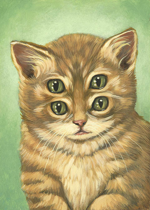
And because it rhymed with 'Britain' and 'Exhibiton', I found this intriguing image of a kitten:
It has no relevance but this painting titled ' Strange eyed pussy' was found on http://kandieklicke.wordpress.com and I like how something relatively normal can be transformed into something very weird very easily.

12th December 2010
Jamarch

Google reading, reading, reading, read.


Here is a screenshot as evidence of the blogs I am following through Google Reader. These are also the blogs I am following on Blogger.

There's not much more I can say on top of that. 

Sausage.

5th December 2010
Jamarch

Blogs which intrigue me, and may or may not intrigue you.

http://apeonthemoon.com/

This is an illustration blog by Katherine Holt which features illustrative and graphic design work which I for one particularly enjoy. By the name alone I could tell I would be interested before I'd even seen the work shown. The simplistic design of the title and layout is very appealing to me as it allows the posts and images on the posts to stand out and cause more of a visual impact. The logo at the top is literally an ape. On the moon. Mind blowing to say the least.

http://www.illustrophile.com/

This blog is also an illustrative blog and I have chosen to include two as the areas that interest me most at the moment are animation and illustration. It is designed and posted in by a large group of illustrators and graphic designs and the the enthusiasm in thier posts and the work on show is what attracts me to it. I would prefer to be viewing and watching a blog in which the type and wording represents the person writing it and not just manufactured copy/pasted dribble. I like it. I like it alot.

This is a general design blog which includes Graphic design, Typography, illustration and many other forms of Art and graphics. The mellow background doesn't detract from the articles in the slightest as it is not vibrant at all and all colours on the page are neutral colours. I love the way the title is on the top right and almost becomes part of the background. And the work featured on it is very varied so when ever I go on I won't know what to expect. The element of surprise is a good one.


This is a blog which focuses on tutorials on different photoshop effects and design techniques. I am not following this blog for the layout or any posts they are making as I personally think it's bland and I dislike it. The tips featured however could keep me occupied for a very long time and I could keep referring back to it and dwell in the archives picking up how to do impressive things on photoshop.


This blog features tutorials and inspiration for general lovers of graphic design. The first thing I notice when I open it is the background and title. The fading design from the top into greyness is possibly my favorite background I have seen in the blogs I have researched. The content is very nice the majority of the time with the exception of some of the tutorials which I am not keen on however, I am following hongkiat for that purpose so if I mentally erase them on FudgeGraphics I will take in what I want to.

2nd December 2010
Jamarch


Klaxons album covers - Photomontage


Both of these images are album covers by the Indie band 'Klaxons'.
I was originally drawn to them because of thier music and I am a huge fan but after research into them and purchasing both of thier albums I am also a fan of the artwork used on the covers of both.
Both of them showcase two very different but effective forms of photomontage and I enjoy them for that very reason. The top is an effort made on photomontage and flows as if it were an actual image of an astronaught cat. While the bottom is made to look retro in a photomontage pasted together style, Still very eye-catching.

I love music. I love art.

26th November 2010
Jamarch

UniuniuniuNiuniuniunIuniuniuniVERSITY

Here I am showing some research in different University degrees which I may be interested in.

Illustration with Animation - Manchester MET University

UCAS code: W217
Length: 3 Years full-time

Entry requirements:

UCAS Tariff points: 240-280
Points to be obtained from full A levels or equivalent:
240 at A2 or equivalent (such as BTEC National at Level 3 or Advanced Diploma).
Level 3 Foundation Diploma in Art & Design would be considered in combination with any of the above.
Specific subjects required: GCSE grade C (or acceptable alternative) English Language
Access qualifications: A relevant Access to HE Diploma will be considered for entry to this course.
Portfolio required as part of the selection process? Yes
Interview required as part of the selection process? Yes
International Baccalaureate: 27
IELTS Score: 6.0. with no element below 5.5
Additional requirements: You would usually have to attend an interview and/or provide a portfolio ofwork as part of the selection process.


"-Provides you with the rare opportunity to combine illustration with animation, developing yourself as a
visual communicator at home in a wide range of professional contexts.

-An experimental course that encourages you to be ambitious, curious and reflective.
-Development of traditional and digital skills including life drawing, book binding, etching, screen-printing,
typesetting, drawing on film, working with sound, imovie, Photoshop, inDesign, Final Cut Pro and
website development."

YEAR 1
.Introduction to the three main blocks of the course; drawing, printmaking and animation.
.Development of skills through a series of projects.
.Introduction to possible strategies for solving visual problems and applications which explore context.
.Starting to identify a framework for your own individual practice.

YEAR 2
.Beginning to experiment more fully with own practice and introduction to real life situations
that you would encounter in professional practice.
.Work with text and narrative, make books, experiment with sound and movement and develop design concepts.

YEAR 3 
.Work more independently and focus on your particular strengths, deciding which contexts are most
suitable for your visual language.
.Gain the courage to be yourself and the understanding of how and where you may contribute to the wider world of visual communication and practice.

Graphic Design - Manchester MET University

UCAS code: W210
Length: 3 Years full-time

Entry Requirements: All the same as the Illustraion and Animation course also at Manchester MET University.


"-Study trips include gallery, museum visits and international travel most recently to New York.
-Opportunities for work placements throughout the UK.
-Students successes include awards in regional, national and international arenas including Manchester City Council, Greater Manchester Police, D&AD Global Student Awards, Young Creative Network and Openad Talent."

YEAR 1
.Introduction to the studio-based culture of the course through a series of projects encouraging the development of ideas, experimentation with visual language and acquisition of technical skills.
.This is supported by a Contextual Studies programme that places practical elements into a wider cultural, critical and social context.

YEAR 2
.Study more specific areas of graphic design practice through pathway options in print-based or digital media.
.A programme of workshop projects develops both technical and conceptual skills.
.Studio content is developed in liaison with industry and offers opportunities for work experience.

YEAR 3
.Study a series of self-directed options designed to develop a professional portfolio that reflects your individual careers aspirations.
.Your work is supported by a visiting lecture programme that offers a diverse range of perspectives across the whole platform of graphic design practice.

Games Concept Design - Staffordshire University


UCAS code: G613
Length: 3 Years full-time,  or 4 years with a placement.

Entry Requirements:

UCAS Points: 280 
Additional: All applicants are individually assessed on their qualifications, skills and experience.

  •  A ground breaking design studies course aimed at producing the next generation of computer games and film concept designers with skills required by the computing and computer graphics industry
  • Digital arts course content designed and developed by ex-industry artist in collaboration with current industry concept designers.
  • Concept design, development techniques and computer graphics taught, covering anatomy, engineering, aviation, architecture, physiology and vehicle design.
  •  Film industry standard 2D Matt painting and 3D compositing using Combustion and After Effects.
  •  All core teaching delivered by industry experienced designers, artists, compositors and engineers.
  •  3D digital arts modelling for both games design and film using 3D Studio Max, Maya and ZBrush

Graphic and Media design - Hereford college of Arts

UCAS code: W216
Length: 3 years full time, 6 years part time.


Entry Requirements:

UCAS Points: 200
Additional Requirements: Minimum age 18, Successful portfolio interview, Mature Students with related experience
"The graphic and media design industries need designers with innovative and original ideas, who are able to work with a range of processes and formats, and who can respond to the exciting demands of the professional industry.

The BA (Hons) Graphic & Media Design course provides students with the necessary skills and understanding in order to explore and apply the creative potential of digital technology to express ideas, and to resolve design and visual communication problems. The course encourages a wide-ranging and creative approach to uses of graphic & media design within contemporary environments, including the ‘3rd’ screen of mobile technology. Print based communication remains an integral part of the course."

YEAR 1
.During the first year, students start to develop an understanding of fundamental aspects of graphic and media design. These include exploring the creative design process and applying design principles in order to effectively communicate in both print and screen based formats.
.Students are also introduced to creative practice processes which includes modules such as ‘Type, Text & Meaning’, as well as introductions to ‘Interactive Design’, and explorations of ‘Narrative & Sequence’. Throughout the year studio activity is complemented by a supporting Cultural Studies lecture programme. This lecture series will explore and challenge the role of the ‘Media Arts’ within the social, cultural and political framework of the Western world during the Twentieth and Twenty first centuries.

YEAR 2
.Year two aims to provide specialist skills and knowledge by exploring the increasingly important role that ‘Image and Identity’ takes within society. In addition to the programme of Cultural and Professional Studies, second year students begin formulating a Business Plan for development in year three. In the second part of the year, students are provided with opportunities to explore and challenge our understanding of ‘designing for screen’, and ‘motion graphics’. Students also explore ‘real’ design problems by responding to a number of commissioned ‘live’ briefs and national design competitions.

YEAR3
.In the final year, the course provides close and continued advice and encouragement from the staff team providing a platform on which students are able to develop their ideas and specialism further. Students work in an increasingly self-directed manner, with a developing emphasis on adaptability including: taking responsibility for their studies and working at a professional level. There is an increased emphasis on research, and critical thinking. A major body of work is produced. This forms the basis of a graduate portfolio.
.Students also work towards a dissertation and final Professional-practice Business Plan. This plan is aimed at selected target markets as part of their move towards a professional career. Throughout the course students explore potential areas for employment by visiting design companies, and meeting professional designers for portfolio consultation.

Interactive systems and Video games design - University of Bradford

UCAS code: G473
Length: 3 years full time

Entry Requirements: 
 
If you are offering any combination of GCE A levels, Vocational A levels, AS levels, and Scottish Framework qualifications, our standard offers are:
Three-year BSc - Around 260 points. To include 160 points coming from 2 GCE A levels, or qualifications of equivalent depth and volume. We also require English, Mathematics and a science to at least GCSE grade C level. Key Skills (level 3) and AS or A-level General Studies points can also be included in the points total. No specific subject requirements, although subjects related to course content would be an advantage.
Three-year BA - Around 240 points, depending on course and subject mix. To include 160 points coming from 2 GCE A levels, or qualifications of equivalent depth and volume. We have no essential subject requirements at GCE A level (we accept General Studies), although subjects involving numeracy, ICT and English may be an advantage. We also require English to at least GCSE grade C level and you will preferably have GCSE grade C or above in Mathematics.
Four-year BSc/BA including Foundation Year - 160 points. No specific subject requirements, although subjects related to course content would be an advantage. Candidates must possess Mathematics and English to at least GCSE grade C level.

"Pioneering within higher education, we have been successfully running Games Development courses for over ten years now and offer two distinct pathways. Both routes examine the technical and creative aspects of computer games and interactive systems, emphasising either the production of games art or more technical issues across a range of platforms.
Whichever course you choose, you'll acquire a clear overview of the various software and hardware technologies used in game development, and an awareness of industry practices. In the first year you will explore the history and conventions of traditional and computer-based games, and develop key skills ranging from level design and 3D modelling and animation, to visual communication.
Progressing onto the second year, you will develop further production skills, including game asset creation and game analysis, and will begin to select your own optional modules and research topics.
In the final year you will specialise in your own chosen areas within Games Development, taking advanced optional modules in subjects such as motion-capture, and engaging in ambitious individual and group project work. Whilst the majority of your time will obviously be spent acquiring skills specifically relevant to Games Development, it is important to note that you will also acquire a range of transferable skills essential in any career environment."


At the moment I am unsure of which University I will eventually go to, It may not even be on this list.
However, These 5 have currently caught my eye and I hope to study into them further. Starting with both Manchester MET courses, As we are going on a trip there next monday which is a perfect oppurtunity to have a look.


 I am still yet to know even which area of Graphic Design I wish to progress to! But which University I go to must not only have a desirable course, it must tend to all my other needs and personal hobbies.


 I hope for the following:

. A very lively music scene - Being a lover of music and a musician for the majority of my life this is probably the most neccesary aspect of where the University is.
. An energetic night life.
. Quite far from home - I want to be able to live indepently throughout my University life and if I am close to home I will be tempted to return home when any minor problems occur.
. Ocean near by - This is not as important but Surfing is an enjoyable hobby of mine and I like to regularly attend to it. I can easily travel in summer breaks etc if not near though.

22nd November 2010
Jamarch

Being There


Jorge Colombo is, in my eyes, a very interesting, exciting artist with a habit for using a unique and distinctive form of media that I have never seen performed so fluently or so, just so well. The blurred blending of colours creating toneful shadows and intricate details look so effortless even when the image is expanded and blown up from the 3" x 2" inch iPhone screen. Yes; These images were drawn on an iPhone application called 'brushes', which uses only one working layer, which is like a musician making a recording in one take - "Theres no going back" and that's the way he likes it. His fascination with iPhone art started when he was browsing the web and spotted the work of Stephane Kardos, A french artist living in Los Angeles, Who also uses the application 'brushes'.

"I like to think that New yorkers who live and move around the city every day look at my drawings and think -Yes! He's got it!"
 His images have been published numerous times on the cover of the New Yorker magazine and his sketches are actually less to do with the famous Manhattan landmarks, and more about everyday glimpses of the city.
"The play of light, the proportions of buildings, the vegetation, and small details are enough for me. I don't feel I have to hit people in the head with an image to give them the feel of the place"
Most of his drawings are different areas of New York, and the main reason for this is it is his home, and using a sketchbook comes naturally to Colombo. A native to Portugal, he has also depicted Vienna and Paris on the tiny screen.
Line and then watercolour was, until his recent fascination in the iPhone art, his chosen method of sketchbook work."Now it's the other way round," he says. As the Brushes application is on such a petite screen, it forces the artist to think in consideration of the design and composition first. Line comes last in the process. Jorge works from background to foreground using only his finger on the screen to draw. This simplistic approach to drawing is very ergonomic, the technology almost disappears and leaves you with only your finger and the phone screen. A ironic use for an iPhone. Not for its intended purpose of keeping in touch with modern society, but to escape from this and draw.


More of his pictures can be found on his website:
http://jorgecolombo.com/index.htm

15th November 2010
Jamarch

Abram Games, What a babe...... and Restless times.

 
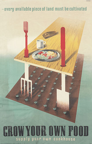
A couple of weeks ago we went to the Restless Times Art exhibition in Sheffield and then to an Abram Games exhibit down the road from it. If I'm honest I did not enjoy the art on show at either however I did see this piece by Abram Games which I found quite cool. The way the cutlery and garden equipment blend into one another is similar to photoshop work of recent times but this was hand drawn and you can tell a hell of a lot of effort was put into it.

Mega.

This painting of ancient chalk monuments cut into the landscape was done by Eric Ravillious and is titled 'The Westbury Horse'. The chalk horse is effective as it stands out from the background but at the same time it sits there as if it was there naturally. The train in the background is also nice but the foreground is where it's at.

The trip, at first seemed mundane and a waste of time but after visiting both I found that even if I didn't enjoy the work personally I still appreciated the artistic thought behind it and influence involved. And subconsciously I must have taken some of the artwork and the techniques involved in, and they will stay with me for a long time to come. hopefully.

<3


10th November 2010
Jamarch

Acid in the Ice Cream

This is a drawing by Zach Johnsen titled 'Acid in the Ice cream'. Ever since I first saw this image I have just been drawn to the simplicity of it. The 'average people' in society's mind exploding into something magnificent and curious. And the title. 'Acid in the Ice cream'. The whole idea around it makes me smile inside quite strangely. Someone expecting one thing and being surprised with something on the other end of the scale. Marvelous.

10th November 2010
Jamarch